collection
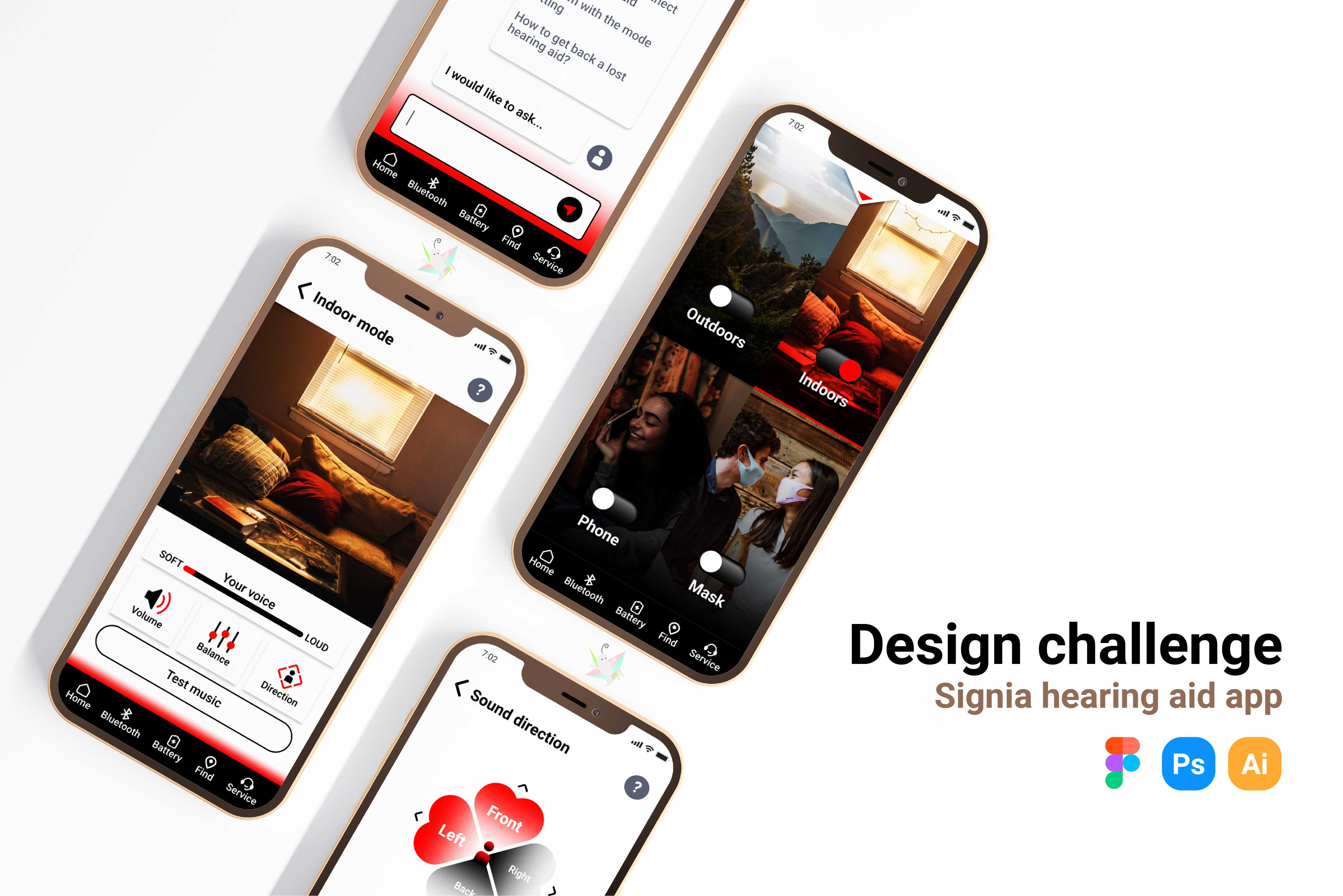
Medical equipment app
Signia is a well-known hearing aid company, a good helper and personal hearing partner for the hearing impaired. This project is an iterative process for personal design challenges.
MY ROLE:UX / UI designer, researcher
DURATION:2022/5/2-2022/6/11
Target users
The study identified two main user groups, the elderly and young adults with hearing impairments.
Persona
James, a retired math professor, needed an app that worked well with his hearing aids, was easy to use, and intuitive because his hearing was getting worse, he wanted an app to control his hearing aids so that He can adjust to the environment.

Adela, a college student, needed an app that could intuitively switch listening modes with her hearing aids based on the environment, and that knew how loud she was speaking let she could speak more confidently.

Empathy Map
The same goes for what Adela said, thought, did, and felt. Among them, there are social barriers caused by the inability to judge your own speaking volume, the beauty of hearing aids, the interface is not easy to operate, and the connection performance is stable.Relevant information:
> Lo ud speech fear of hearing impairment
Dealing with the Hearing Impaired

Journey Map
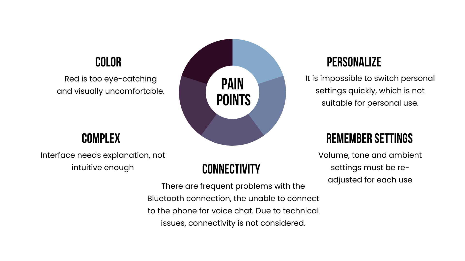
3 points worth noting:
1. When she started to use the interface, she felt that the eye-catching red was too dazzling, and many key operations were red and white. It felt uncomfortable after watching it for a long time, and she wanted to quit the app quickly.
2. It seems that the App cannot save the changed settings, and it is inconvenient to switch the mode according to the environment in a short time.
3. Some functions need to watch videos online to know how to operate...

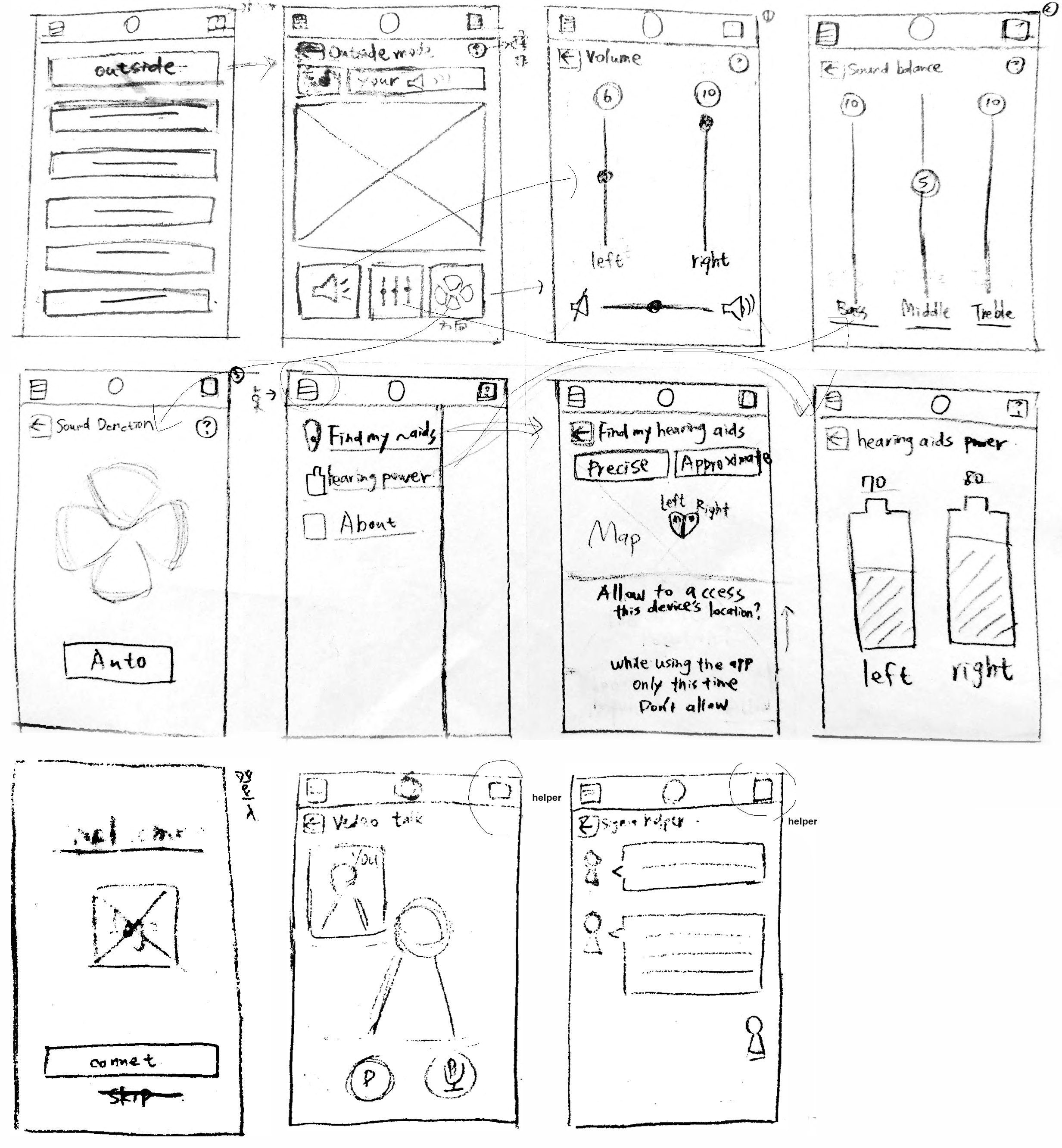
Wireframe
From the perspective of hearing aid users, plan the most needed process routes and interfaces to help users save time.
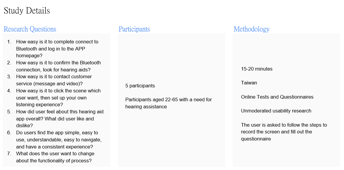
Usability Study
Explain the operation steps and screen recording method, and conduct a questionnaire survey after completion.Design user research through online ethnography and questionnaires.
> View research proposal
Affinity Figure
.jpeg)
.jpeg)
Find out
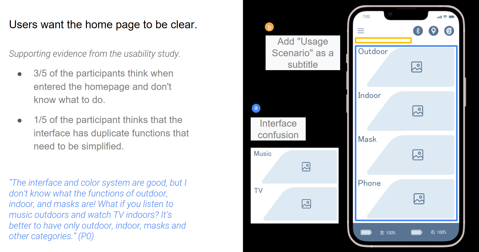
3 out of 5 participants thought when entering the homepage and didn't know what to do.
One-fifth of the participants felt that the interface had repetitive functions and needed to be simplified.
"I don't know what the functions of outdoor, indoor, and masks are! What if you listen to music outdoors and watch TV indoors? It's best to only have outdoor, indoor, masks and other categories." (P0)
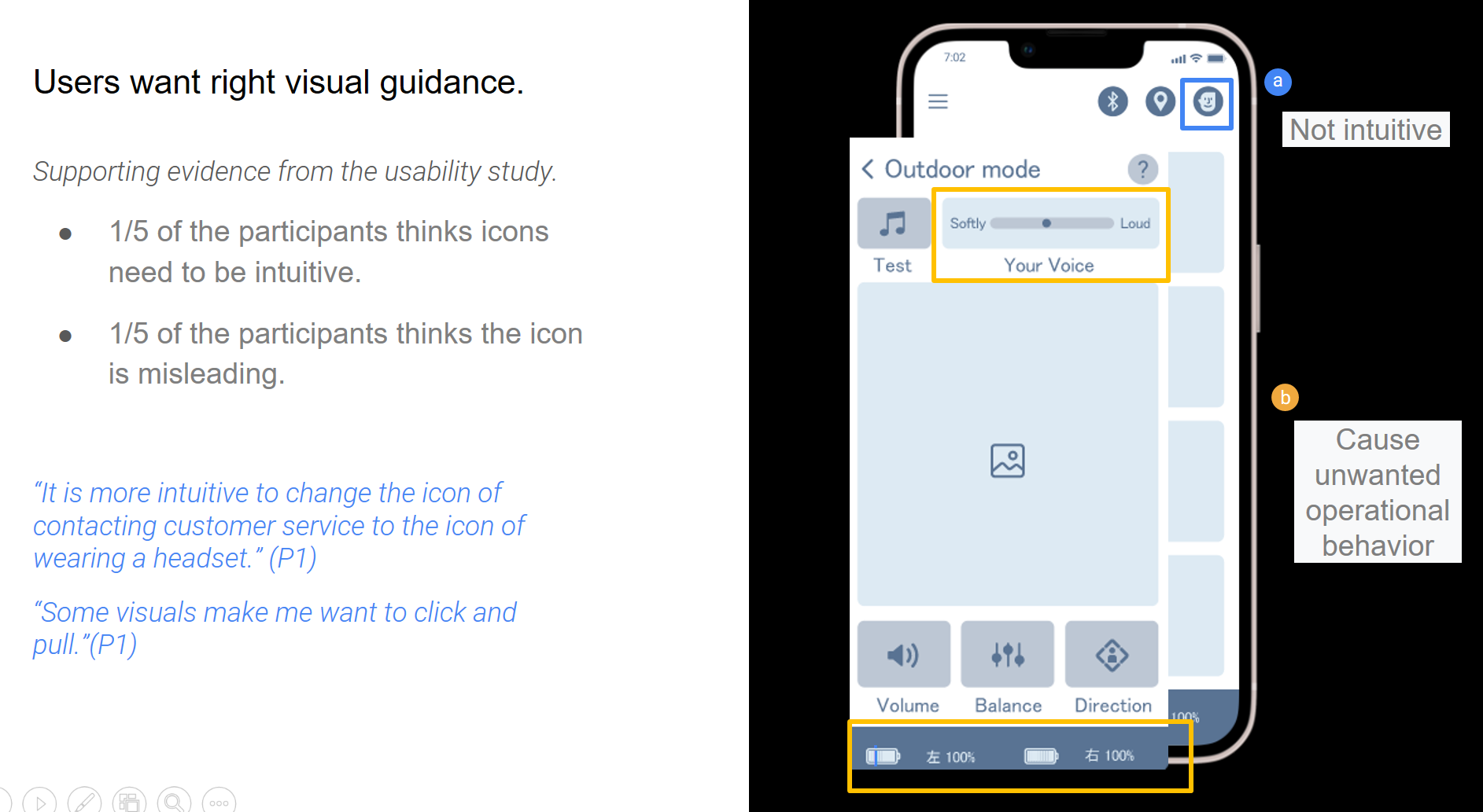
1 in 5 participants felt that icons needed to be intuitive.
1 in 5 participants found the icon to be misleading.
"It's more intuitive to change the icon for contacting customer service to the icon for wearing headphones." (P1)
"Some visuals make me want to click and pull." (P1)
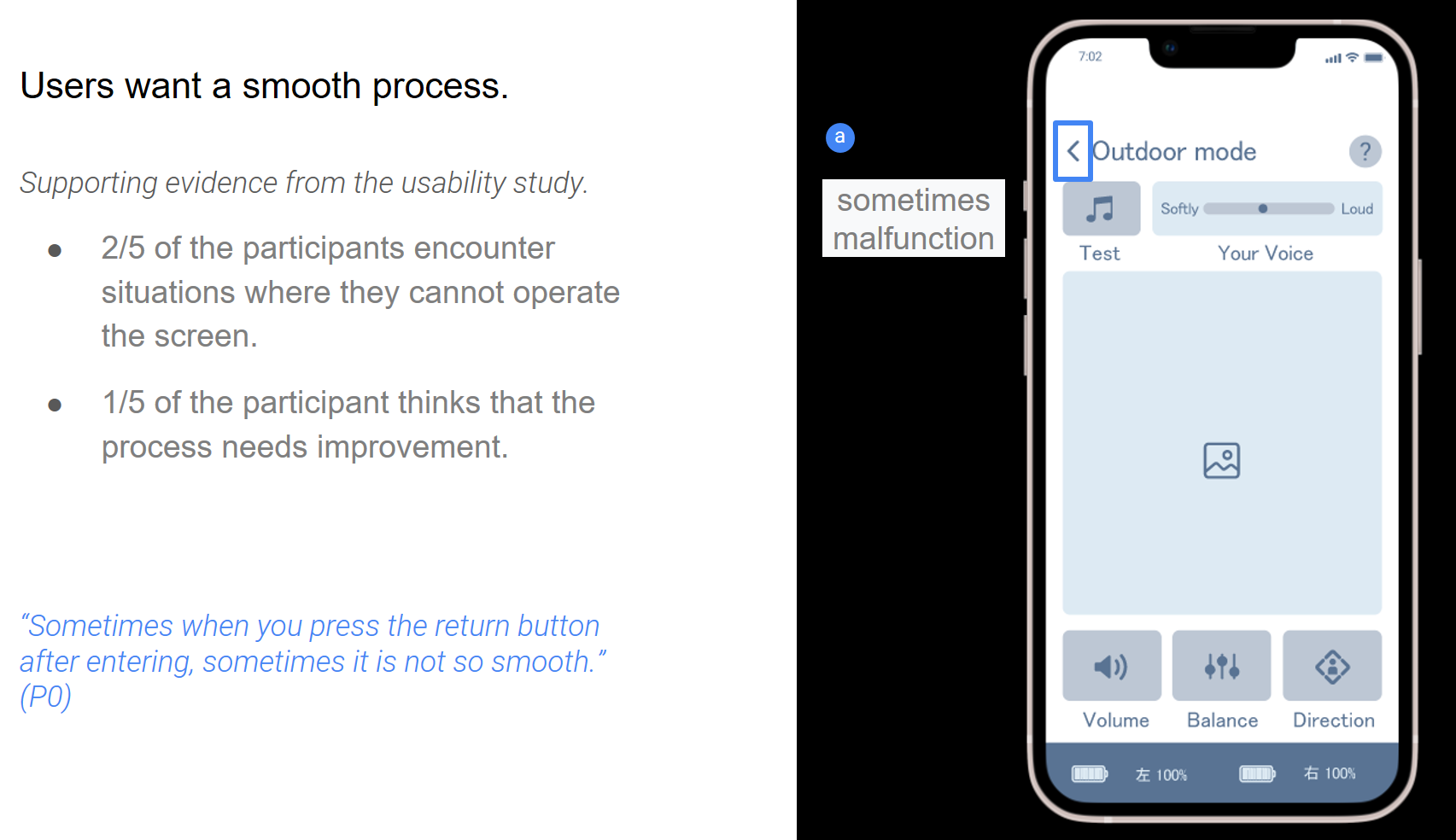
2/5 of the participants experienced the inability to operate the screen.
One in five participants felt that the process needed improvement.
"Sometimes I press the return button after entering, and sometimes it's not so smooth." (P0)
Insights
Round 1 Survey Results
1. The home page is not intuitive, and the switching occasion is not clear
2. Some icons are visually misleading
3. Unable to memorize settings
4. Frequent Bluetooth connection problems
(The 3&4* questionnaire did not state that there is no practical function, causing users to misunderstand.)
5. Back button operation is not smooth
----------------------------------------
Round 2 Survey Results
1. Users want a clear home page
2. Users want visual guidance right
3. Users want the language to guide correctly
4. Users want a smooth experience
Accessibility Considerations
1. Text and background colors ensure user visibility of colors through WebAIM colour contrast.
2. The function buttons were originally distributed at the top and bottom of the page, but were changed to be concentrated in the lower navigation bar, which is more in line with user intuition and facilitates faster search and use by any user.
3. A mode switch button has been added on the home page to facilitate any user to better switch the listening mode.
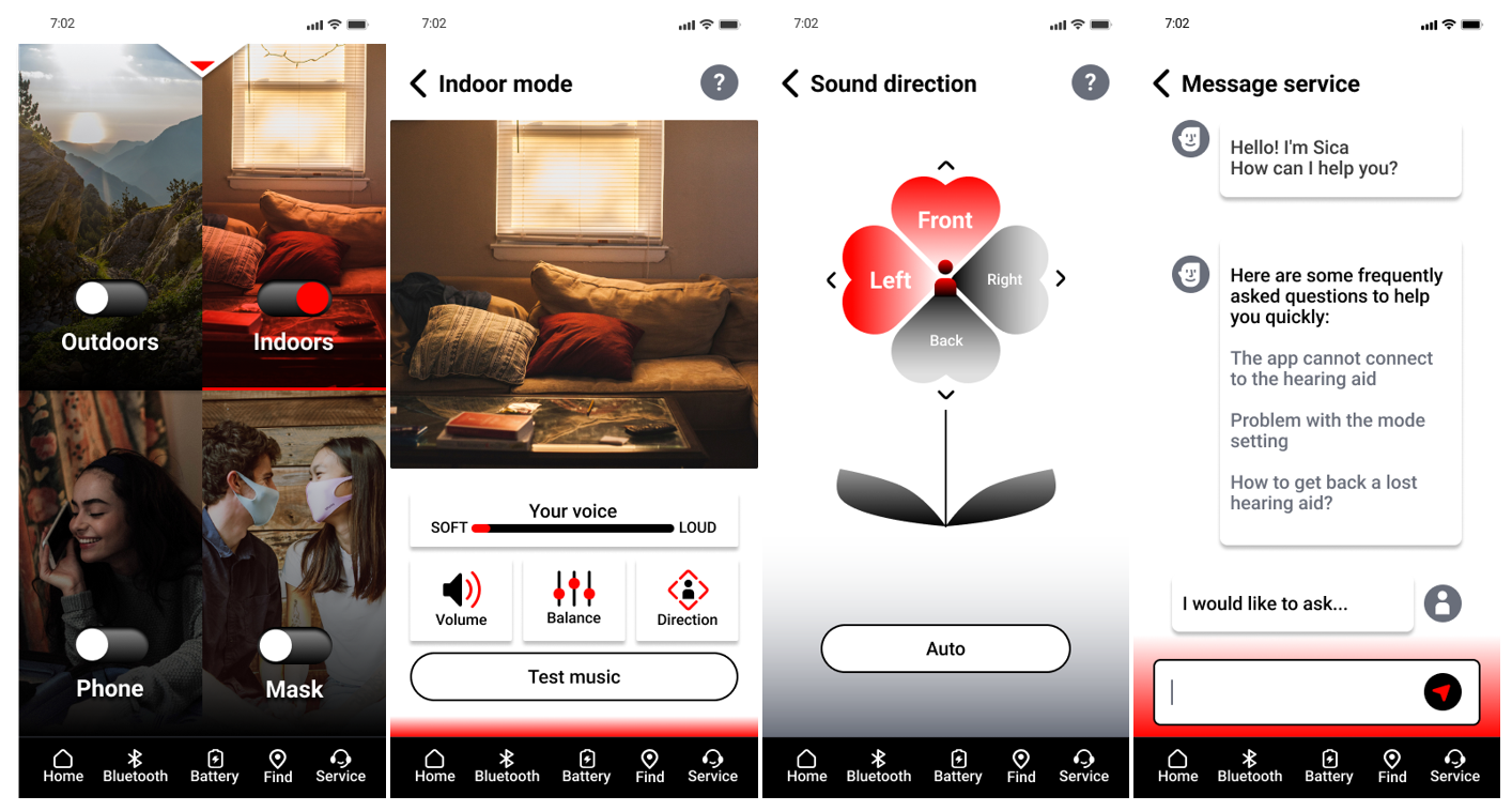
Mouckup
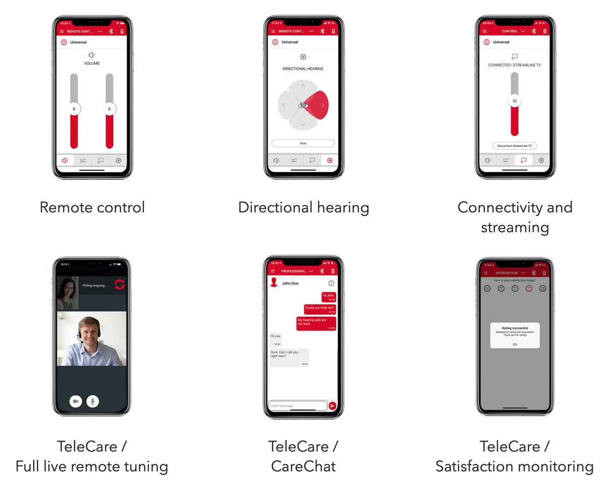
After usability research, many users responded that the homepage was not clear enough to understand how to operate, so a hidden app operation description page was added to form a drop-down menu at the top. There are also modes that confuse users, such as indoor mode and TV mode: if you watch TV indoors, which one should you choose? Reduced from 6 modes to 4, due to users needing fewer modes, and observing that many users ignore the button in the upper right corner and change the button to the bottom when operating.
Social media app
Playsee is an app that promotes real-life sharing through short videos. Unlike TikTok, which focuses on meme viral sharing, and Instagram and YouTube shorts, which emphasize marketing, Playsee prioritizes genuine community sharing and aims to foster communication in the real world.
Note:This is a design challenge

Original
Observe
Playsee's core market positioning revolves around "connecting the community" and embracing "authenticity". Given that there are already platforms for sharing life's moments, one might wonder why the market needs Playsee. Perhaps, focusing on "how to provide services related to community search, establishment, sharing, marketing, and operation" can become the core of this product. Through algorithm recommendations or interactive maps, everyone can find like-minded people, making it easier to connect virtually to real communication.
The previous version of the homepage had too much text and was not visually appealing. However, the latest version managed to solve this problem by adopting a TikTok-like algorithm-driven large-screen video playback feature, making the app more attractive. However, the unique map feature that allowed users to "search and choose themselves" was removed from the search page. Considering that the product’s "goal is to connect people rather than just entertain", an all-algorithm-driven approach may not be entirely suitable. For applications that connect communities, more human participation and interaction are required to create a deeper connection and social experience. Currently, the app is mainly focused on sharing short videos called "Spots and simple community chat," but there is still huge potential for community engagement and interaction.
Envisioning the Future
The potential significant value of this product to society lies in connecting people from different locations, enabling travelers and professionals to integrate into local ecosystems worldwide, thereby stimulating local economies. People are free to create various long-term communities and short-term activities to promote connections between regions and unlock cooperative potential among individuals. For instance, community connections could be integrated with local revitalization efforts and put some concept of a Decentralized Autonomous Organization (DAO) in. Playsee tokens can be used to incentivize local economic spending and reward users, assisting local businesses with marketing and connecting them with potential customers. The bolder dream is to inspire people to eagerly share their lives, where everyone can initiate projects, promote collaboration and development within the global community.
Today's social media has a big pain point, that is, it pays too much attention to individuals and beautiful images, which leads people to compare mentality and deteriorates the connection between people. Therefore, we should pay attention to groups and society again, regain the beauty of the community, and let people get together because of hobbies and ideas, just like in clubs, volunteer activities, etc., get together because of common beliefs, and unite for common goals or hobbies. Let the community return to its essence, connect people and people's purpose, and realize a better vision through joint efforts.
Potential future applications may include in Playsee:
1. Promoting business cooperation: Playsee can connect local businesses, assist in marketing and advertising, and offer users exclusive offers.
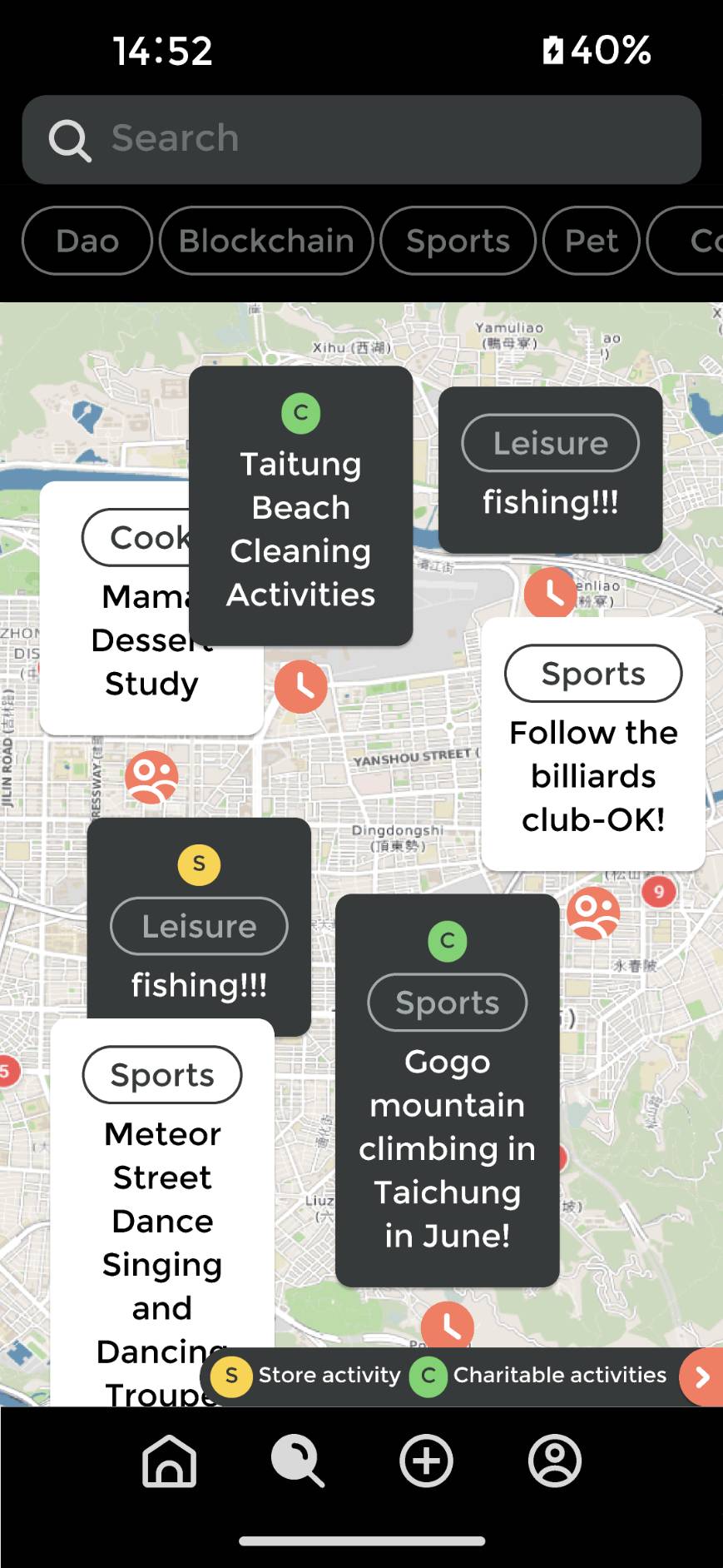
2. Fostering social good: Anyone can independently organize local events, such as beach cleanups and various social initiatives. Playsee can reward users with tokens for creating and participating in communities and events.
3. Advancing local development: Recognizing and rewarding participants in community activities and events with tokens or titles, implementing gamification strategies to revitalize communities, and enabling global participation in local activities.
In conclusion, Playsee aims to revolutionize social media by emphasizing real-life connections and authentic community interactions. With the power of people's support and participation, people can create a vibrant, interconnected world where sharing moments and experiences brings people closer, fostering collective well-being and prosperity.
Solution
Suppose user A: Amy's journey

1. Amy's purpose on the homepage: Curious and aimless browsing ( entertainment has no purpose ) > Algorithm-driven recommendation > The design remains unchanged

2. Amy's purpose on the search page: Find and make friends with like-minded people ( purposeful behavior ) > to have algorithmic recommendations and independent map search functions > The design focus on creating a richer and more complete experience for community functions.
Current solution > According to the timeliness, it is divided into two community cards for easy creation and search.
I. Long-term interest groups (Club): such as book clubs and similar communities.
II. Short-term groups (Activities): environmental initiatives, cooperation with local businesses, pop-ups, business events, etc.
III. Increase community experience


3. Amy's purpose in the creating page: Find like-minded partners and friends, give back to the community, and earn rewards > The design focuses on creating events, clubs, and attractions easily, and making the process fun and sustainable
In progress...not yet...

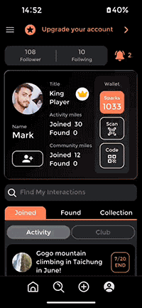
4. Amy's purpose on the personal page: Find and set information about personal and joined...etc > The design focus on building a personal system, adding brand and management thinking, and establish a personal communication card and community management system.
Add reward mechanism: Spark as the cornerstone of the ecosystem
>> Named Sparks because of the sparks of human interaction as tokens.
>> The reward mechanism of gamification is to be designed, such as participating or creating 10 clubs to get 10 Sparks, getting titles... etc.) (Refer to DAO / Web 3 / Token Economics)
------+++
Others
Community ratings and comments: Allow users to rate and comment on the communities or activities they have participated in, and display related ratings and comments on the search page. This helps other users better understand the quality and activity of the community.
Event schedule: Provide event schedule or calendar function, allowing users to view the specific time, place, and detailed information of community activities. This helps users plan their time and schedule their participation in communities or events that interest them.
Goal
Making the product more aligned with cats' instincts
Based on ( Research & experience )
1. Are These Cats Playing? A Closer Look at Social Play in Cats and Proposal for a Psychobiological Approach and Standard Terminology
2. Observations of Behavior While Playing with Two Cats at Home
Background
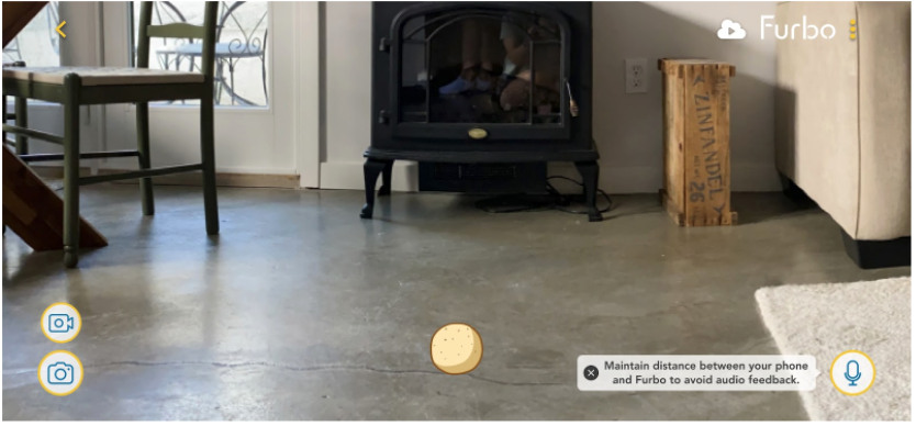
Cats' play behaviour can be categorized into social play (interaction with other cats or humans), object play (interaction with toys), and self-play (solo activities). Particularly, interactive hunting games can help them learn hunting skills and socialize. Cats' play requires irregular movements, and objects that mimic prey behaviour are more likely to capture their interest. The current feeder is a modified dog version, with added feathers to mimic a cat toy. Typically, a cat toy like a feather wand is manipulated by a human, allowing for more freedom in movement. However, due to its limitations, the feeder can only rotate regularly, with a restricted range of interaction. This limitation might lead to cats losing interest in the toy.
Strategy
Taking inspiration from laser pointer games and existing apps for pet interaction, we can design the feeder's laser feature to enable interaction between the owner and the cat. For example, the owner could control a laser pointer dot on their phone screen, mimicking the motion of tossing the feeder, and the cat would chase and play with the laser dot.
- Some relevant competitor product references :Infrared automatic cat teaser
- Different pattern projection :Laser cat teaser
Proposal ( Location / Time )
Reference original UI/UX of interactive feeding
Reference original UI/UX of interactive feeding
.gif)
Go to Figma
Next
- Furbo can be equipped with wheels to remotely control its movement range.
- Incorporate augmented reality (AR) technology to project more realistic different kinds of virtual prey for cats to chase and hunt.
- When the technology matures, it can be combined with pet language translation.
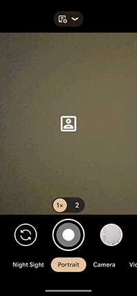
Google Camera Pain point
According to user feedback collected from Google Play in May 2023, the most important and urgent user request regarding the interface is the ability to toggle HDR on and off. There are two proposed solutions: Solution A is solely based on user feedback, while Solution B combines user pain points to simplify the operation and enhance usability.
User pain points:
P0: Ability to toggle HDR mode
My findings:
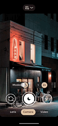
Switching camera modes is not intuitive enough.
1. Many sliding options can be consolidated to improve the overall shooting experience. For example, the standalone Portrait mode is easily accessible by swiping left, but when users need to capture panoramic or other mode shots, they have to swipe all the way to the right. The interface should be simplified by combining these 'lens modes'.
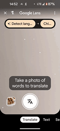
2. There is a lack of a shortcut to return to the camera or access shooting information while using the Lens, which disrupts the user experience.
Note: The interface design example is based on my usage of the Pixel 5 phone, where the camera automatically detects lighting conditions and adjusts to the day or night mode. Night mode is used as an example.
Original
Solution
Plan A
Original interface plus HDR switch
Plan B
Rethinking the purpose of camera lenses and how camera users utilize them to redesign.
1. Added on/off HDR mode, most of the pain point is to turn off HDR, so HDR off is set to default mode, turn it on again if necessary.
2. Assign individual functions to each block. Keep advanced professional settings at the top unchanged, while merging and simplifying the interface for the blocks below to make it more intuitive to use. Based on user needs, categorize camera functions into three categories: Searching Lens, Camera, and Video.
3. After integrating the camera modes, users can easily switch to other lens modes such as Landscape, Macro, and Panorama. The functionality of the video recording mode remains unchanged.
4. Add a camera button on the Lens to facilitate quick return.
5. Add macro photography mode.
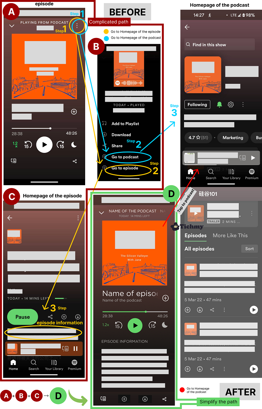
Spotify pain points and solutions

Pain point I

Initially, the fast-forward button was circular with an animation that showed a swaying motion up and down. This led users to associate it with creating biological life, which was not the intended connotation. To address this, the enterprise side removed the button head, but this created a new problem - it became an ineffective button that was difficult to use. Users thought it was a "program playback progress bar" rather than a fast-forward function. The latest version has now added a square head back to the button, effectively resolving the issues mentioned above.
Pain point II
When listening to any episode of a podcast, if the host mentioned anything or was suddenly curious about the program information, I often need to find the information page of the current episode, but I don’t know how to get there directly. After research, I found that the current process of finding information can be difficult to navigate. Pain point: The current page has too many steps, and some of the function navigations are a bit confusing. Moreover, there is duplication of functionalities because most users access content through two routes:
Browse & Search keywords :
Those who do not know the program yet, can search for related programs through keywords or browse through the compiled playlist and enter the episodes.
Be recommended :
People already know about the podcast because of an ad or a recommendation from someone else, and then they will directly search for it.
So the pages only need episode page and the home page of the podcast.
Solution
Simplify pages to make navigation easier. Combining the common features of the three pages A, B, and C into one episode page D, users can access program information through sliding actions. After viewing the information, users can continue to share, download, or perform other actions using the available buttons, hopefully making the overall listening experience smoother.